
Photo by Jeffrey Leung on Unsplash
Position Property in CSS
Understanding the static, relative, absolute, sticky and fixed positions in CSS


While designing a webpage, we often require some elements to be positioned in a certain manner. This can be achieved by using the CSS position property. Understanding how the elements are being placed using the CSS position property can be a bit confusing in the beginning but once you get the hang of it, designing the webpages becomes so much easier.
As the name suggests, the position property is used to set how the element is positioned in a document. The various positions are Static, Relative, Absolute, Sticky and Fixed. Default position value for an element is Static. Let us look at each of these positions with the help of examples.
Static
All elements by default have position value as static and it is the normal flow of the document. The top, right, bottom, left and z-index properties do not have any effect on static positioned elements.
HTML
<div class="parent__container">
      <div class="square square1">Square 1</div>
</div>
CSS
.parent__container {
  background-color: rgb(208, 204, 241);
}

.square {
  width: 100px;
  height: 100px;
  border: 1px solid black;
  display: inline-block;
  margin: 0.8rem;
}

.square1 {
  background-color: rgb(110, 223, 110);
  position: static;
}
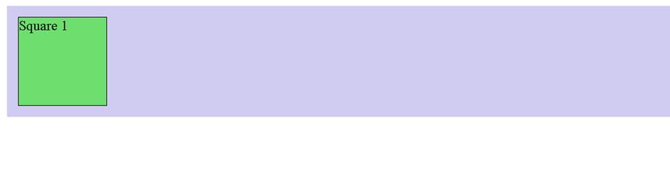
In the above example, we have applied position: static to square 1.
Relative
On applying the position value as relative to any element, initially no visible difference will be visible since it is positioned according to the normal flow of the documents. Once the values for top, right, bottom or left are provided, the element is then shifted based on the values relative to its own original position i.e. relative to itself.
This does not affect the position of the other elements on the screen and the element having position as relative still occupies the same space as it would have if its position were static. So there will be a visible empty space where the element initially was before the offset values were set.
HTML
<div class="parent__container">
      <div class="square square1">Square 1</div>
      <div class="square square2">Square 2</div>
      <div class="square square3">Square 3</div>
</div>
CSS
.square1 {
  background-color: rgb(110, 223, 110);
}

.square2 {
  background-color: rgb(240, 240, 90);
  position: relative;
}

.square3 {
  background-color: rgb(243, 122, 243);
}
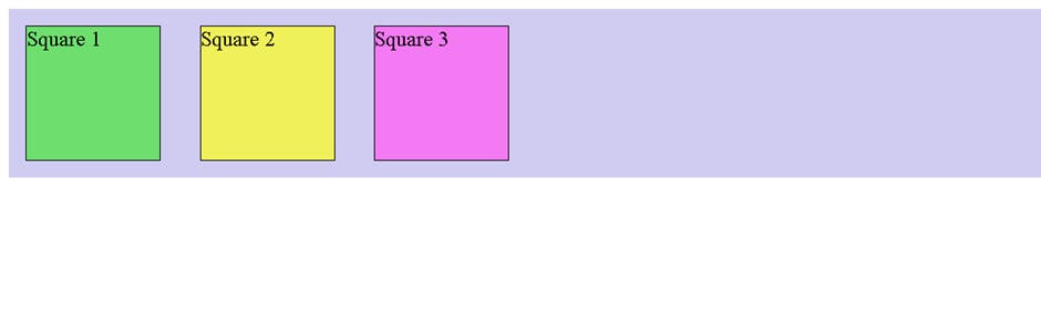
In the above example, we have applied position: relative to square 2 and as we can see that visually we cannot see any difference in the position of square 2 yet.
Now we have added the top and left offset values to square2.
.square2 {
  background-color: rgb(240, 240, 90);
  position: relative;
  top: 2rem;
  left: 4rem;
}
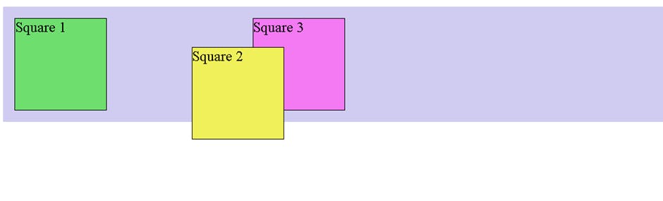
Here we can see that the position of the box has changed relative to its initial position and it is shifted down by 2 rem and shifted right by 2 rem based on the values provided for top and left. Also we can see that the position of the surrounding elements are not changed and the space occupied by square 2 is still the same as it was before the offset values were applied.
Absolute
The absolute positioned elements are removed from the normal flow of the document and no space is created for that element in the page layout. The absolute positioned elements are placed based on the values of top, right, bottom and left with respect to their nearest parent elements having position as relative. And if none of the parent elements are positioned, then the absolute positioned element is placed with respect to the page itself. These absolute positioned elements do not affect the position of the other elements.
CSS
.parent__container {
  background-color: rgb(208, 204, 241);
  position: relative;
}

.square1 {
  background-color: rgb(110, 223, 110);
}

.square2 {
  background-color: rgb(240, 240, 90);
  position: absolute;
  top: 2rem;
  left: 4rem;
}

.square3 {
  background-color: rgb(243, 122, 243);
}
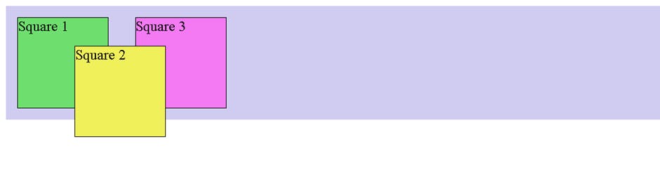
In the above example, we have applied position: absolute to square 2 and we can see that square 2 breaks from the normal document flow and its surrounding element i.e square 3 occupies the space left by the square 2. The square 2 is then positioned based on the top and the left value provided with respect to the nearest parent container having position value as relative
Sticky
The sticky positioned elements initially behave like relative positioned elements but the difference becomes visible when one starts scrolling the web page. On scrolling the page, these elements stick to the screen depending on the value provided for top or bottom. If these values are not provided, then the sticky positioned element will behave like any other relative positioned element and we will not be able to see the sticky effect.
HTML
<h1>This is an example of position sticky</h1>
    <p>
      Lorem ipsum dolor sit, amet consectetur adipisicing elit. Fugit nam, est
      molestiae expedita quisquam eligendi alias exercitationem ab earum, porro
      perferendis unde provident suscipit voluptatum minima voluptas. Velit,
      molestias exercitationem.
    </p>
    <div class="banner">This will stick</div>
    <p>
       Lorem ipsum dolor sit amet, very long text...
    </p>
CSS
.banner {
  background-color: chartreuse;
  position: sticky;
  top: 0;
  height: 10rem;
}
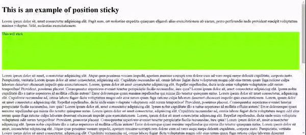
In the above example, we have applied position: sticky to the banner and initially we cannot see any change in its position. But once we start scrolling, we can see that the banner sticks to the screen when it satisfies the condition of top: 0 and once it sticks to the top, then it does not scroll with the other content of the page.
Fixed
As the name suggests, the elements having fixed position will be fixed on the viewport. So even when the page is scrolled, the element will remain fixed in their original position. The fixed positioned elements are placed based on the values of top, right, bottom and left with respect to the viewport. These elements are removed from the normal flow of the document and no space is created for that element in the page layout. The fixed position can be used for page navigation bar which should be visible even when the page is scrolled.
HTML
<div class="banner">This is fixed</div>
    <p class="content">
      Lorem ipsum dolor sit amet, very long text...
    </p>
</div>
CSS
.banner {
  background-color: chartreuse;
  position: fixed;
  top: 0;
  height: 4rem;
  width: 100%;
}

.content {
  margin-top: 5rem;
}
In the above example, we have applied position: fixed to the banner and we can see that on scrolling the page, the banner is fixed on the same position and is not scrolled with the rest of the page. We have given some margin-top to the content since no space is created for the fixed positioned elements in the normal document flow and hence they overlap the other contents on the page. To avoid this overlap, the content is given some margin top so that it is not hidden under the banner.
I hope now you have got some idea about positioning elements. By using a combination of these positions, it becomes very easy to manipulate the elements on the web page to create great web pages.
Happy Coding 😄 !!